Thorngrove Wines – Branding & Packaging Design
When I was approached to design the branding and packaging for Thorngrove Wines, I was instantly drawn to the personal significance behind the brief. My client had a clear vision: to build a wine brand that honoured his Welsh heritage, his upbringing, and the traditional values of winemaking. Projects like this — rooted in personal story and symbolism — are always a privilege to work on.
A Name Full of Meaning
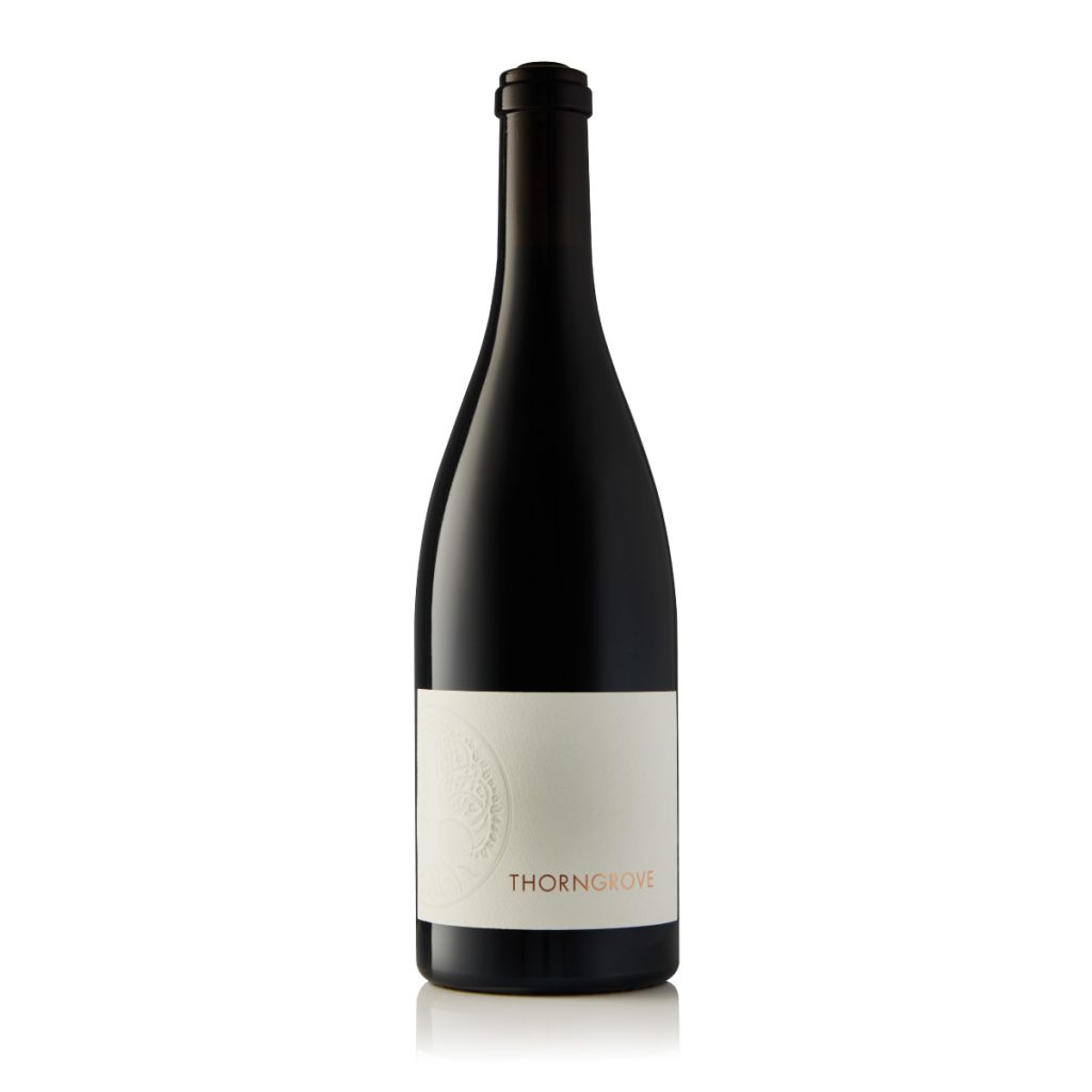
The name Thorngrove isn’t just elegant and brand-worthy — it’s the name of the street where my client grew up. It holds deep sentimental value and is woven into his personal history, which made it the perfect foundation for a wine brand that’s as authentic as it is distinctive.
Symbolism in the Logo
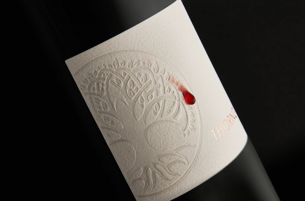
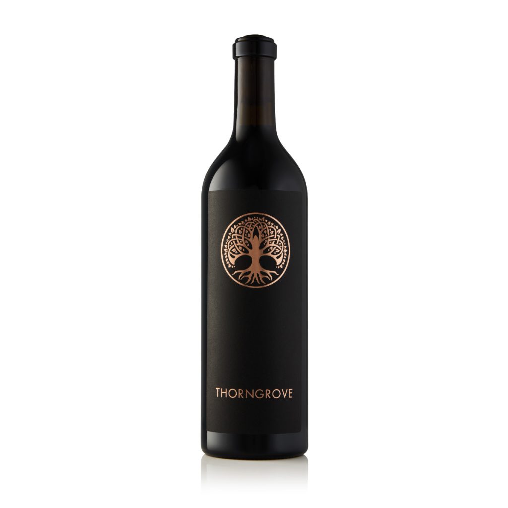
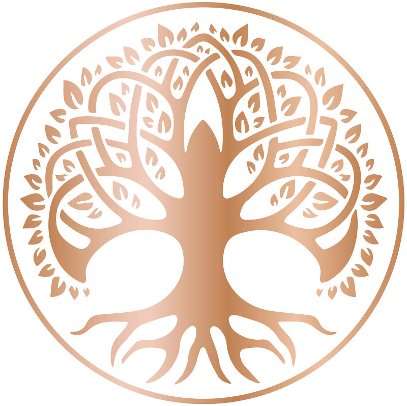
At the core of the Thorngrove logo is the Celtic Tree of Life, a powerful symbol in Welsh and Celtic culture. It represents strength, endurance, and the spiritual connection between the earth and the heavens. This symbolism also beautifully mirrors the role of oak in winemaking — French, American, and Hungarian oak barrels shape the wine’s aroma, structure, and longevity, just as the oak tree sustained generations of Celtic life.
The Role of Rose Gold
The brand’s use of rose gold was inspired by the legacy of Welsh gold, a rare and highly prized material once mined in the mountains of Snowdonia. It has strong ties to Welsh tradition and has been used in royal wedding rings for over a century. Beyond its visual elegance, rose gold became a symbol of purity, rarity, and craftsmanship — core values my client holds dear in his winemaking philosophy.
Crafting the Identity
My goal was to create a visual identity that captured all of these rich layers: personal history, heritage, and a commitment to quality. From the custom logo to the wax tear-drop detail and premium packaging design, every element was developed with intention — and now proudly trademarked to protect the uniqueness of the brand.
Award Recognition
The design for Thorngrove Wines was honoured with a Bronze award at the 2021 Wine Label Design Awards, sponsored by Rotolabel South Africa. This recognition celebrates thoughtful, original packaging design in the wine industry, and it was a proud moment for both myself and the client.
This was more than just a wine label design project — it was an opportunity to tell a story through considered, strategic, and beautifully crafted design.